
Is Your Website Mobile Ready?
A Mobile-Ready Website
Better Website Design

.
Is your website mobile-friendly? If not then the time is getting close when your position in search may be affected. Google’s newest algorithm change is about to go into effect soon (April 21st). Many website owners are concerned.
The hope of Google is that you are ready. Are you?
Google has made it clear. They have announced they will have a preference for sites that have a mobile-friendly design. Websites that aren’t mobile-friendly by April 21, 2015 may see a significant dip in their Google search rankings. If you haven’t made plans to transition to a mobile-friendly design or you’re just unaware of the requirements, don’t panic.
In this post I’ll layout what you need to know about the update and the changes you need to make.
I will cover:
- The Thinking Behind the Google’s Mobile-Friendly Update
- Why is This Mobile-Friendly Update Important?
- What are Your Mobile-Friendly Design Options?
- How Do You know if Your Site is Mobile-Friendly?
- Your Next Step

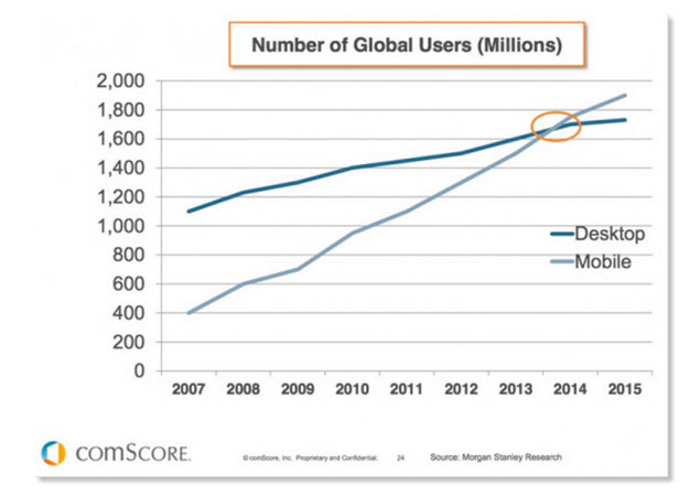
Google’s newest algorithm update will focus on a mobile-friendly design. Mobile is a hot trend right now. More and more people are accessing websites with their smart-phones and tablets. These devices now combine for over 60 percent of all online traffic. Mobile device use surpassed desktop use in 2014 and the gap is only increasing.
Remember that Google tries (as hard as it can) to be just like a human. Today, this means that it has to act like a human when it comes to the devices humans use to view websites. Mobile devices are very popular. Google wants to make sure users have the best online experience possible from the search results that they display. That means making sure websites are quick and efficient whether it’s being viewed on a desktop or mobile device.
Don’t annoy your mobile device visitors – delight them!
If you want to view live tracking of the number of smartphones being sold then click here to view the tracking on Internet Live Stats.
The Way Google Sees It – The Thinking Behind the Update
Mobile users are becoming more and more annoyed with websites that are not optimized for phones and tablets. Google is taking notice. Users want easy to press buttons, a quicker way to find pertinent information, and the site to size perfectly on the device of their choice. No more sifting and pinching to make sure the website fits properly. This sliding, pinching and expanding is annoying to your hard-earned visitors and far from delightful.
Websites that are slow to load and difficult to navigate when using a phone may be penalized by both your visitors (they leave) and now by Google (lower position in search). How much a site will be penalized by Google is still unknown.
When Google makes changes to it algorithms ranking position changes. When it released the Penguin and Panda updates, they affected approximately 4 and 12 percent of all searches. Google says this new change – with an emphasis on being mobile friendly – will affect more sites than the number that was affected by both Penguin and Panda.
Why Is This Mobile-Friendly Update Important?
If you’re in the business of building revenue online, this website enhancement is extremely important.
For example, if you’re in the restaurant or travel industry, a mobile-friendly website is critical. When making choices of where to go on a trip or where to go for a bite to eat, people are first pulling out their smart phones to look for more information. They will also use a search engine (namely Google) to conduct as search.
What is Google presents your site that has been designed for a desktop user experience. On a desktop computer, your website may look wonderful. It may have a cool and delightful design. It may have wonderful photos. It is delightful!
However, on a smart phone it does not display that well.
Here are issues with the site when viewed on a smart phone:
- The text is too small
- The navigation buttons or text is too small (not finger-friendly)
- The pages load slowly (the wonderful photos slow down the site)
- Key information for mobile visitors is hard to find
- There are error messages
At the very start the user is having a poor experience.
The searcher moves to a competitor’s website.
Don’t get into trouble with Google!
If Google has looked bad presenting your site your site may be in trouble. Google will not be happy that your site has made it look bad. Result: Google penalizes your site. You lose position in search.
In a competitive market, top search results are becoming harder and harder to achieve. Website owners need to strive to be on the first page of Google. However, with shorter user attention spans, it is becoming more important to be found not only on the first page but be one of the top five results on page one.
Websites that have a mobile-friendly design, are quick to load, and follow Google’s guidelines will have an easier time showing up in Google search for important keywords.
What Are My Mobile-Friendly Design Options?
Here are your options:
Option 1: Create a dedicated mobile-friendly website.
Option 2: Use a responsive design.
Dedicated Mobile-Friendly Website
By creating a mobile website you will need to manage two websites – mobile version and desktop version. The mobile version option need not be expensive since the mobile version most likely will be a simpler version of your main site. It likely will not have as many images or graphics and you could also remove video content to streamline the mobile version of your site.
It makes good business sense to offer the best to your visitors.
It is sensible for a business that caters to a large number of visitors using mobile devices to have a dedicated mobile-friendly website.
Responsive Website
Your second option is utilizing responsive design. A responsive design scales with the device that is being used to view it and may also reconfigure itself. For example – the menu structure may change from a horizontal alignment to a vertical arrangement. When you make changes or updates, it will automatically apply to mobile as the desktop version and the mobile version are really one in the same.
This is possible because responsive design uses both CSS (cascading style sheets) and HTML (hyper text markup language) to create web pages and translates them into a format for all devices.
The beauty of a responsive site from a visitor’s perspective is that it automatically adjusts the size of all elements in the layout according to the screen resolution and device being used. That means no more zooming and shrinking the page to fit a screen.
Note that as good as a responsive design and layout might be it still will not be as good for viewing on a phone as a dedicated phone-friendly website. If you know that a high percentage of your visitors are using phones to view your site then a dedicated mobile website is probably best to ensure you delight them.
Mobile-Friendly Test
How can you quickly check to see how your site looks with various size formats?
Here is a link to a site that enables you to view (test) your site as if on a phone, tablet and desk top monitor – Responsive Website Design.
Your Next Step
What you are seeking to achieve is a delightful experience for your visitors – no matter what device they use to reach your content. You also want to stay on the good side of Google.
Responsive designs automatically scale up and down and sometimes even reconfigure themselves automatically. We design using WordPress and all of our themes are responsive.
A dedicated mobile-friendly website will be the best solution for your visitors that use a phone.
There is still time to optimize your website with a mobile-friendly design. Significant ranking penalties on Google may not occur right away. However, it is not something you want to leave to chance or put off and hope for the best.
A mobile-friendly website can help your standings in Google and will no doubt offer a better user experience for those visiting your website using a mobile device.
Is your site ready? Google is clearly paying attention to this so we need to as well.
If you want to learn more about responsive website design or a dedicated phone-friendly version of your website then give us a call at 802-457-9799 (EST) or use this form.
Responsive Website Design
 About Gary Horsman