
The Importance of Your Twitter Header Graphic
 Your Twitter header graphic can be a major factor in how someone views your Twitter account. It can also be a factor many consider when they are trying to decide whether to follow you or not. The header graphic is something that helps me to decide whether to follow or not.
It is a good move to create a Twitter header graphic that is captivating, a header graphic that is true to your brand and helps people to understand quickly what you are all about.
Here are some of my favorite Twitter header graphics and why I like them. Each of these header graphic examples has a very real human aspect to them. This is important on social media.
Jeff Bullas @jeffbullas

This header graphic is simple and gives us something important to look forward to that is educational. The references to Forbes, The Huffington Post and The New York Times adds credibility. The background runner indicates fitness, action, and progress and every business wants to be fit, active and to make progress.
Words such as “learn”, “innovate”, and “win” are all positive. The smaller font for “As featured in:” is nice as it lets us know why that sub-graphic is there but the small font lets us know Jeff is not bragging (well perhaps just a little ;-)).
Barb Davies @BarbDavies373

Clean, clear and succinct.
This header has nice colors that work well together. The “barb” to the left, in purple font, matches the background color to the right. Her image in the header is happy and confident. She looks like someone who would be pleasant to work with. This header graphic gives us something to look forward to related to brand identity (always important), network growth, and sales using an important tool.
I also like how she has chosen three words to emphasize key ingredients to her approach on the left. These 3 words – “business”, “Social Media” and “Life” must be connected within her approach and the word life is in bold font – subtle and effective.
Madalyn Sklar @MadalynSklar

This is another simple and clear header graphic. Effective communication is simple and clear.
We can see that she is the host of a Twitter Chat which adds to her credibility and by putting this in the header, with the hashtag, gives people a chance to learn more and see her in action if they choose to join the chat. Also, by joining the Twitter Chat requires people to take only a small step to get to know her better. Social media is all about getting to know people and multiple small steps are more effective than trying to get someone to make one big leap.
I like that she is a blogger and podcaster as this tells me that she must be doing research and she is willing to share her research. Again, very consistent with social media marketing.
Dawn Marrs @dawnmarrs

As you can see, there is a common theme that runs through this post related to the headers that I like. It is one of simplicity and header graphic of Dawn Marrs is a perfect example. There are 3 complimentary colors. The tree suggests growth and life and the M of Marrs and/or Marketing is cleverly built into the trunk of the tree. I am a bit partial to marketing so the tree trunk connotation works very well for me.
The words also explain enough to create interest. What is meant by automate? I need to find out! The two other words are indicators of a promise and something to look forward to – all positive!
This is a simple and elegant header graphic.
Lindsey Stirling @LindseyStirling

Lindsey Stirling is certainly a brand with a distinct style and this header graphic works well for her brand. It is textured and has gems to punctuate the image. The big photo of her is well balanced with the rest of the header. She is looking down and has a thoughtful composure but seems ready and poised for action – so Lindsey! Her hair is being blown by a breeze (just a bit) which is also consistent with her playing style and brand. All good.
I know that this is a post about the header image but I want to point out her bio image. She holds her violin upside down so that there is a suggestion that she may not be exactly the prim and proper violinist we may have pictured in our minds when we think of a violinist. She turns the conventional thinking about a violinist upside down.
Kaleigh Moore @kaleighf

Kaleigh is a freelance writer. You get the impression right away that her hands are often on her keyboard. It is an action shot for her profession.
Again, simplicity rules.
She positioned the hands on the keyboard right above her bio photo so that we know the hands are the hands of a writer (a writer’s selfie). The mouse is off to the side and faded out because it is the keyboard where ideas turn into something that can be shared with others – it is the keyboard where value is created for others.
banksy @thereaIbanksy
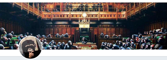
I had to include this one because it is so cool.
I am not really sure if this account is the real Banksy (one can never be sure about Banksy) but it is fun and funny. Also, graphically it is well done. It is not the simplest of images and should not be as Banksy is not so simple. It is ironic and satirical which is consistent with the Banksy brand. Banksy may not like that I view Banksy as a brand just like a big organization but none-the-less Banksy is a brand and moreover a global brand.
 Many people think that Banksy is associated with London. Perhaps Banksy may even live there some of the time.
This image does make a connection to London for us and helps us to think that this may indeed be The Real Banksy.
Where is the human aspect to this header you may ask? Well, it may be Banksy after all and Banksy always gets us to think a bit more. Perhaps this header graphic connects humans with our past . . . or perhaps our future!
Twitter Header Graphic -My Summary
- Make sure that your header graphic is true to your brand.
- Make your message clear and simple.
- If you can get someone to imagine a better future by following you on Twitter then do so.
- Do something a bit different and clever to help captivate your ideal audience.
- Use high-quality graphics.
- If you want to have a measurement that you can track then consider a ratio which is your new followers over your profile visits. If you change your header graphic in an effort to get more followers then you can track this metric to see if your header changes are helping (or not). You can get these data in your Twitter analytics.
Here is a list of my favorite Twitter accounts. I created this as a list on my Twitter account. Feel free to look over this list and if you want to share a Twitter account or two of your special Twitter header graphic then this would be super. Use the comment box below.